PROJECT OVERVIEW
The product:
Cloud Boba app is a mobile application created for users to place orders for the bubble tea shop “Cloud Boba”. It allows orders for in-store, pick-up, and delivery along with other benefits such as member rewards.
Project duration:
September 2023 - December 2023
The problem:
App services are not accessible to certain user groups and lack equity. Some app features are difficult to navigate as well.
The solution:
The solution is to create an accessible app for all users in terms of usability and equity and extend app services.
The goal:
Cloud Boba App will make the bubble tea ordering experience as smooth and convenient as possible. The app will offer ordering ahead of time for pickup as well as delivery services for all menu items. The app will also have accessibility tools such as translation for other languages, screen readers, voice recognition, etc. There will be item descriptions, photos for each item, and an easy-to-navigate, eye-pleasing design.
My role:
UX designer and UX researcher
Responsibilities:
User research, wireframing, prototyping, conception, delivery
Design Process:
UNDERSTANDING THE USER
User Research: Pain Points
1) Accessibility: Lack of translation services, screen readers, voice control, alternate texts, etc.
2) Time: Limited Delivery Service and no order ahead option
3) Information Architecture: Complicated design and lack of photos and item description
PERSONA: Bilqis Karim
Problem Statement:
Bilqis is a work-from-home single mother of two young children who needs easy navigation and detailed item descriptions. Bilqis also struggles to get around due to her prosthetic leg and needs delivery services.
User Journey Map
Mapping Bilqis’s journey revealed how helpful it would be for users having difficulty with navigating complex designs. Bilqis has also helped me understand the need for item descriptions, photos, and delivery services for all menu items
STARTING THE DESIGN
Paper Wireframes
This is an image of paper wireframes including five different versions of the same screen and one drawing of the refined version. I drew these wireframes while keeping user pain points in mind and settled for the last drawing at this stage.
Digital Wireframes
I ended up making changes to the homepage digital wireframe. I added a box for language options for users who needed translation services.
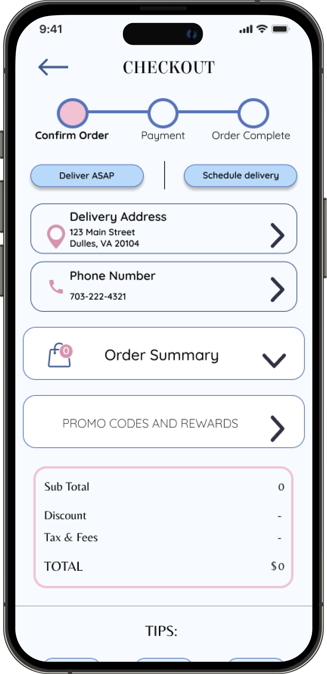
On the wireframe for the Checkout page, there is an option for delivery and pickup.
Low-fidelity Prototype
After creating the digital wireframes, I proceeded to build a low-fidelity prototype. The first version of this lo-fi prototype was then used to conduct a usability study to gather data and insights and further iterate the design.
Usability Study: Findings (Round 1)
At this stage of the design process, I recruited 5 participants to conduct a usability study of the low-fidelity prototypes. Below is a list of observations and themes derived from the studies organized in an affinity map.
Insights
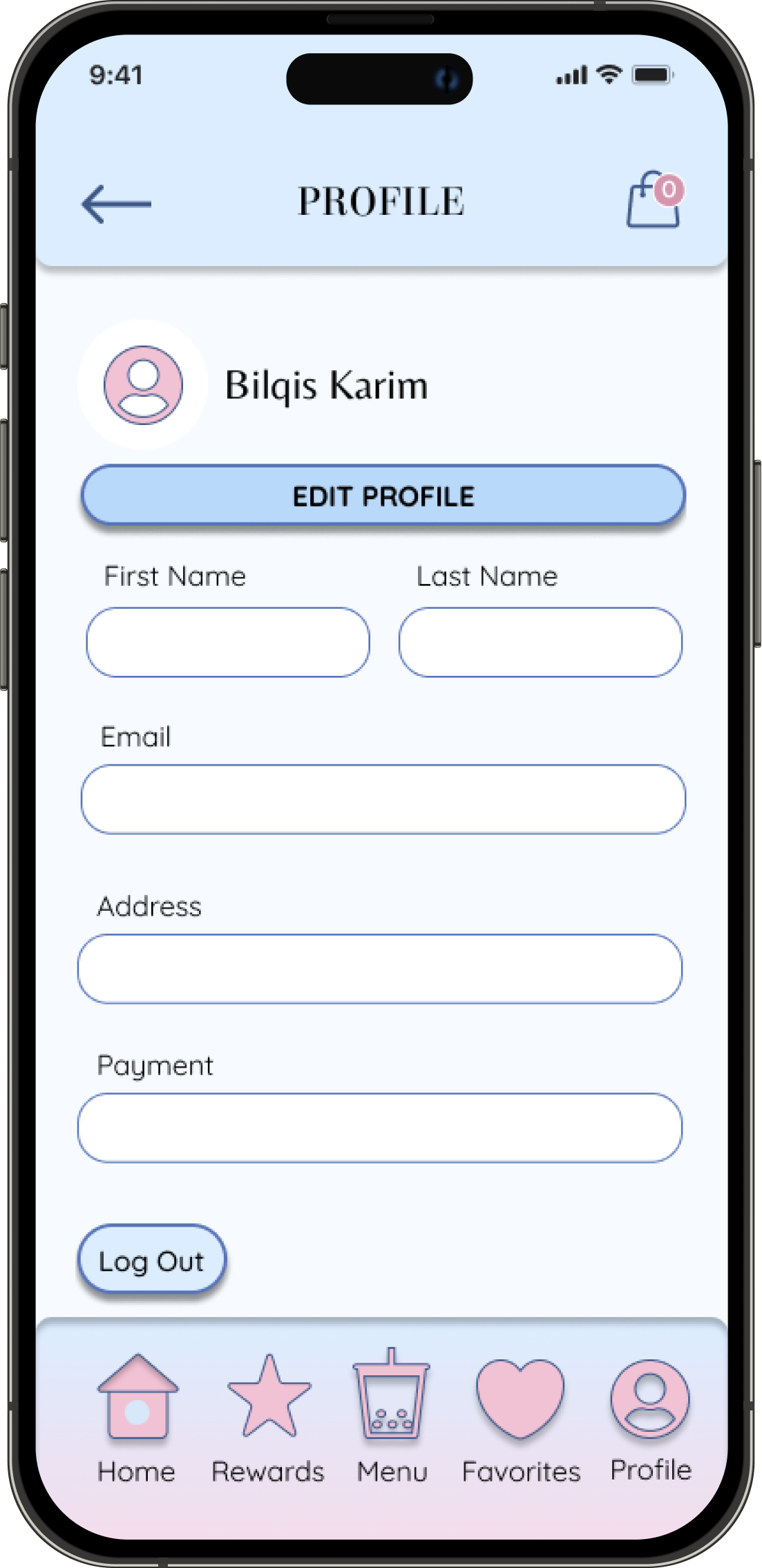
1) Users want a logout button on the Profile page
2) Users want to save their favorite drinks
3) Users want to schedule pickup
Lo-Fi Prototype
Below is the refined low-fidelity prototype that I updated reflecting the insights I have gathered after conducting the first round of the usability study.
Click the top right arrows on the embedded figure below to interact with the prototype in full screen.
REFINING THE DESIGN
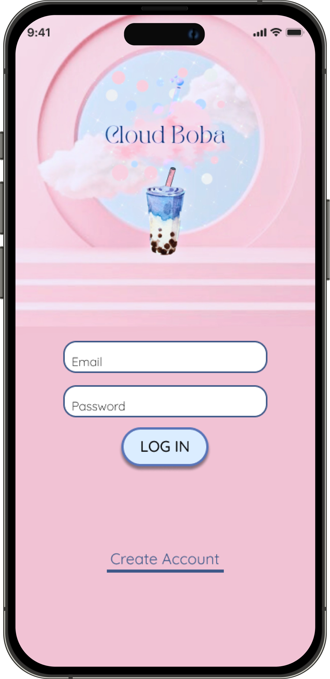
The client for this case study is Cloud Boba, a future bubble tea cafe that wants to feature its brand identity in all its products. The client's signature is bubbly and resonates with their values of friendliness and innocence. Their colors are soft pink and light blue with variants of similar shades that represent the look of a vintage divinity.
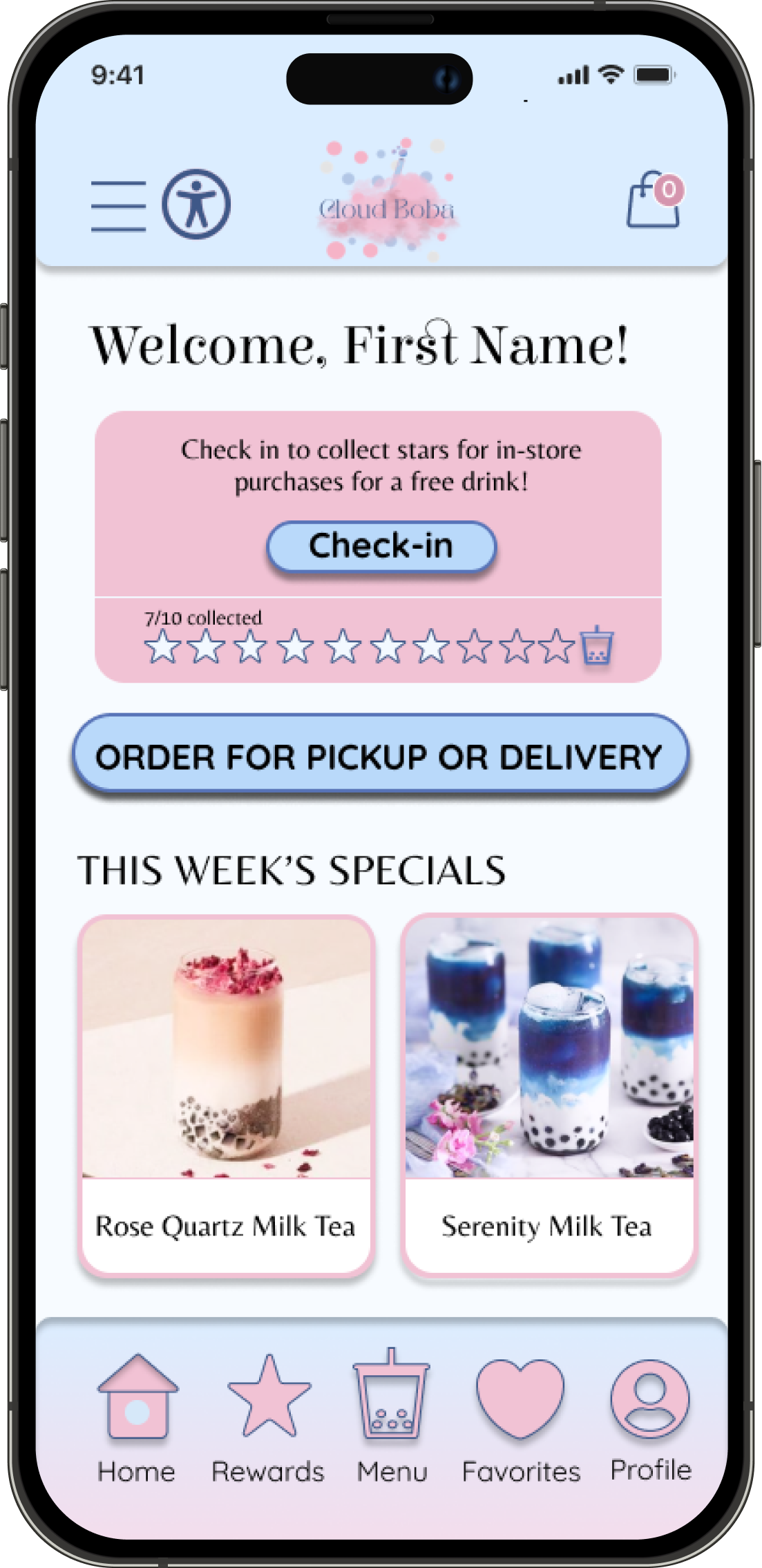
I used their chosen brand colors and applied them to the mockup and high-fidelity designs.
Usability Study: Findings (Round 2)
After designing the mockups and high-fidelity prototypes, I conducted a second round of the usability study. I have gathered data and observations which helped me find insights for the next set of changes that I apply to my final designs.
Below is the link to the usability study sheet for rounds 1 and 2.
Usability Study Sheet
Insights
1) Lack of accessibility tools
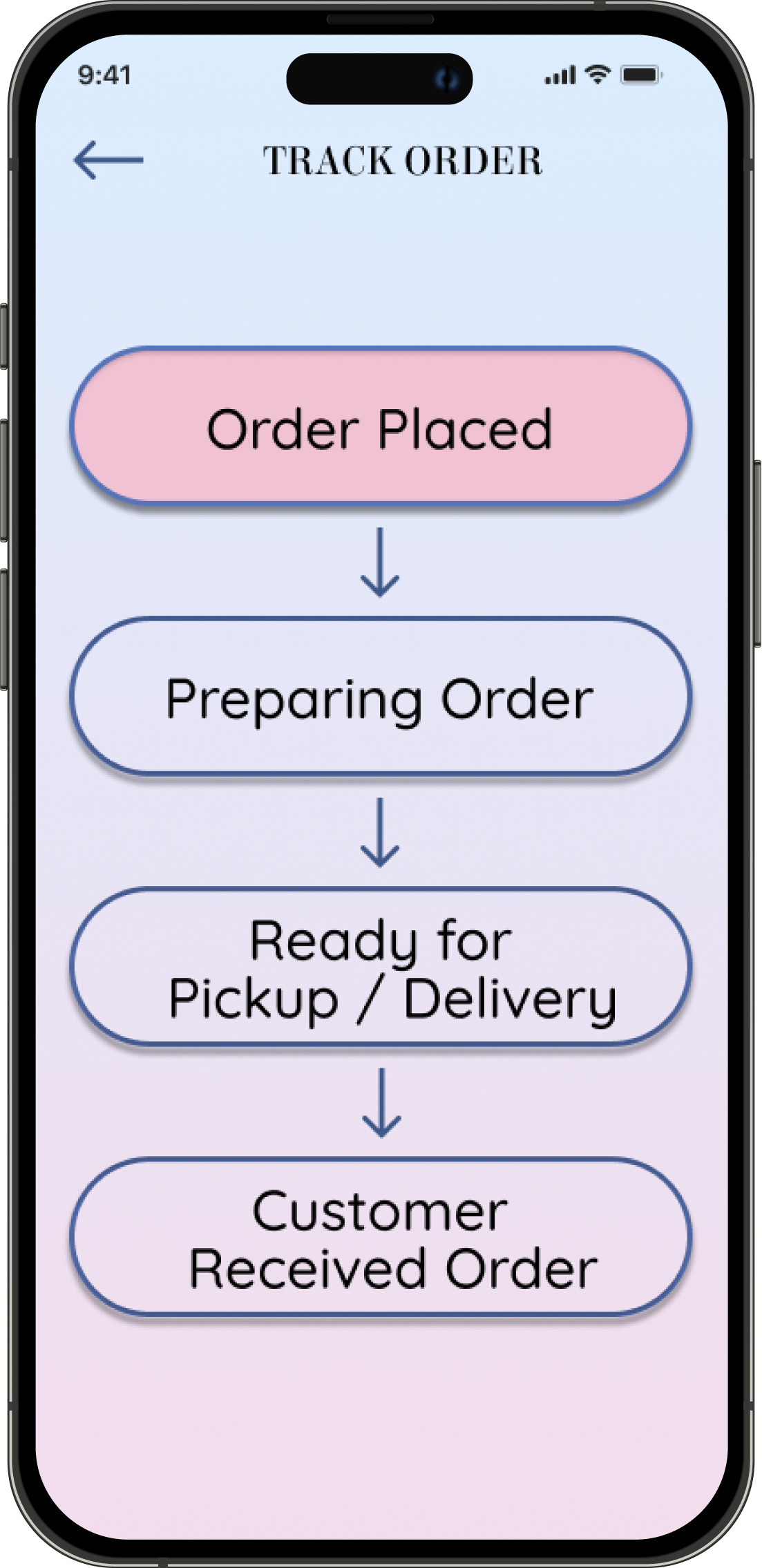
2) Users want to track order
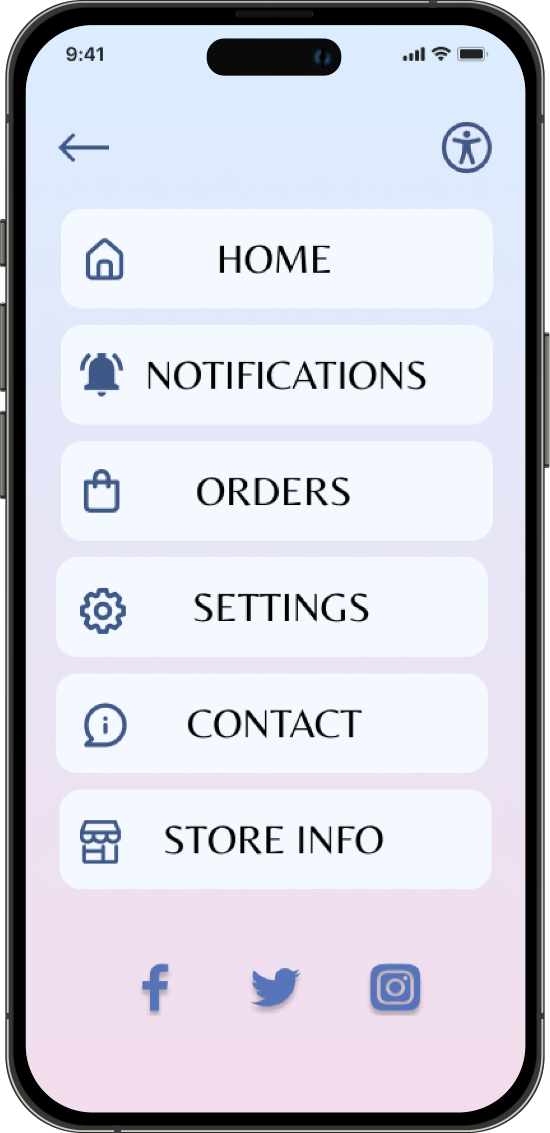
3) Users want favorites at the bottom instead of notifications
Mockups
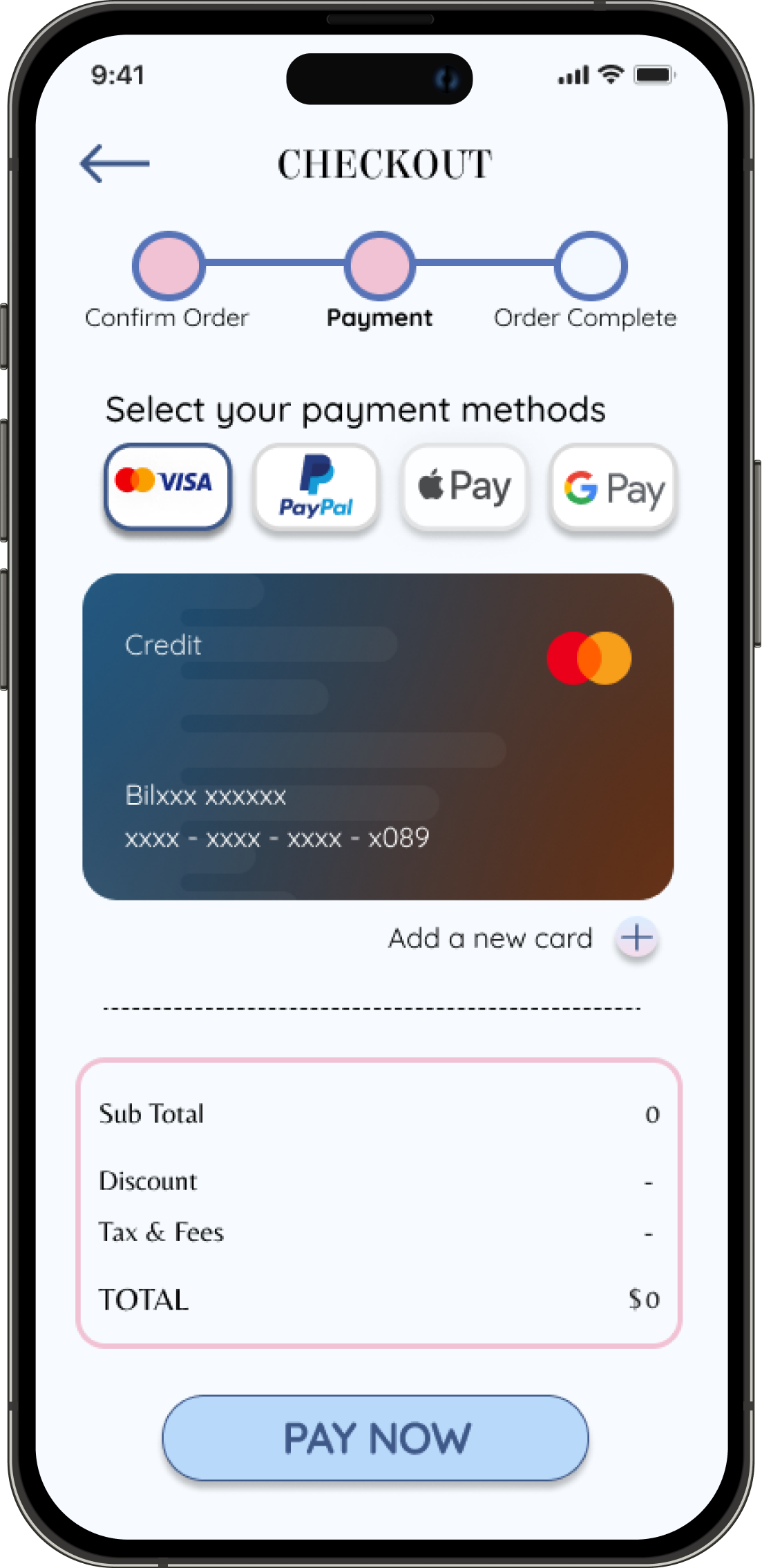
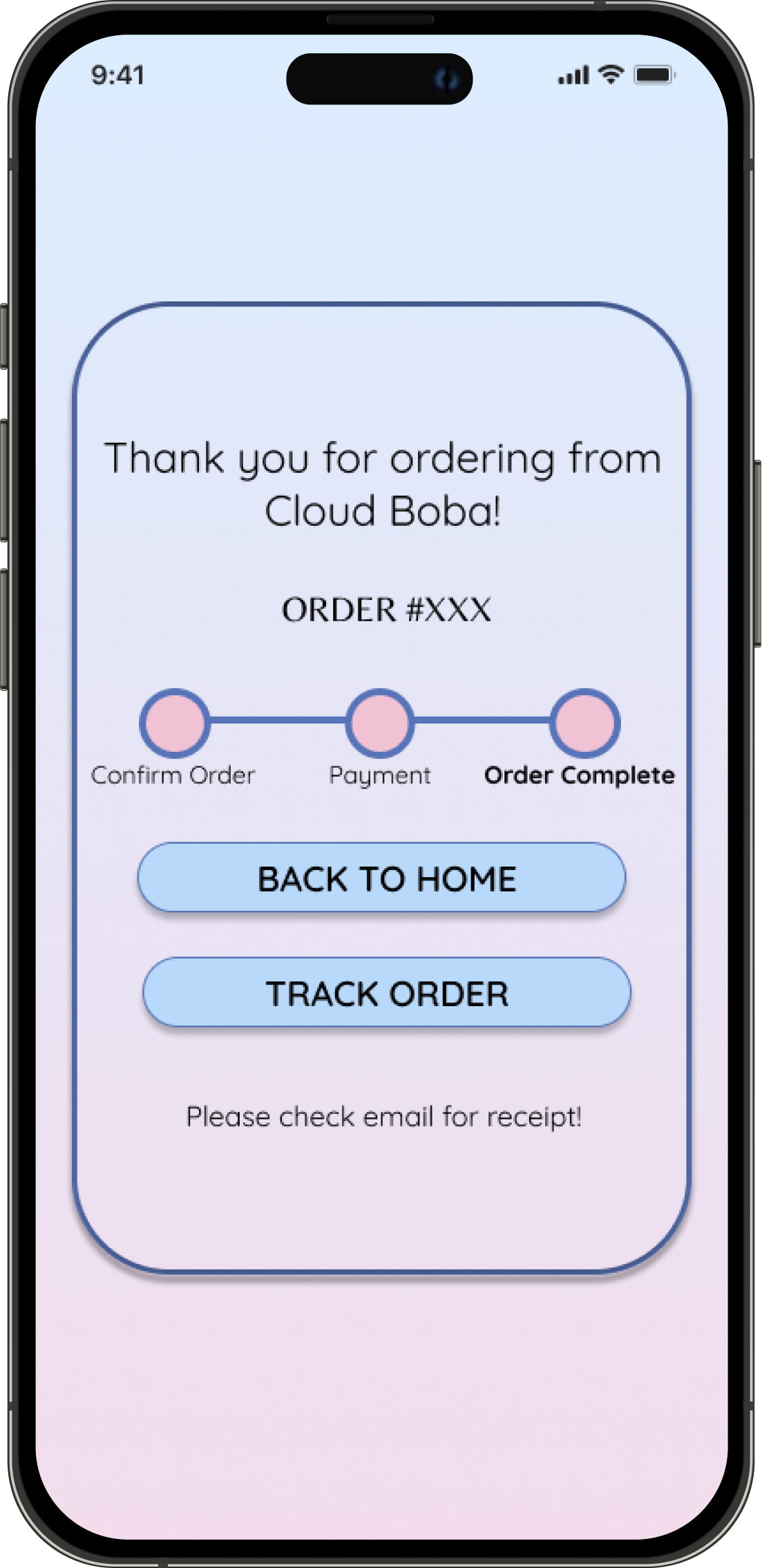
I have made some changes to the mockup designs based on the insights found from the second round of the usability study.
High-Fidelity Prototype
Click the top right arrows on the figure below to interact with the hi-fi prototype in full screen.
Final Designs
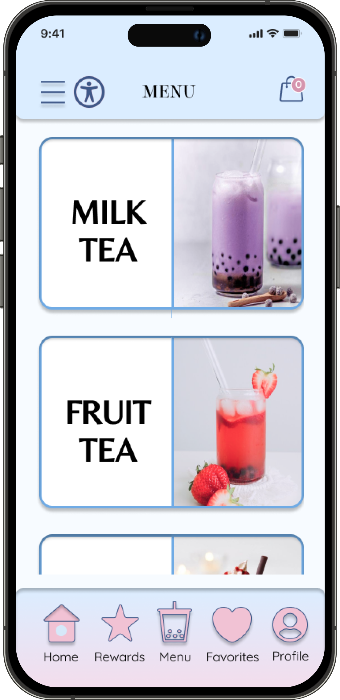
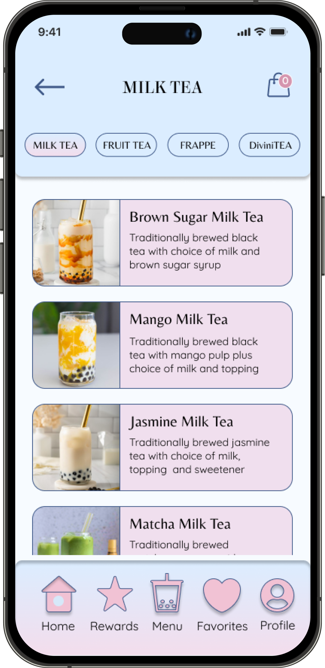
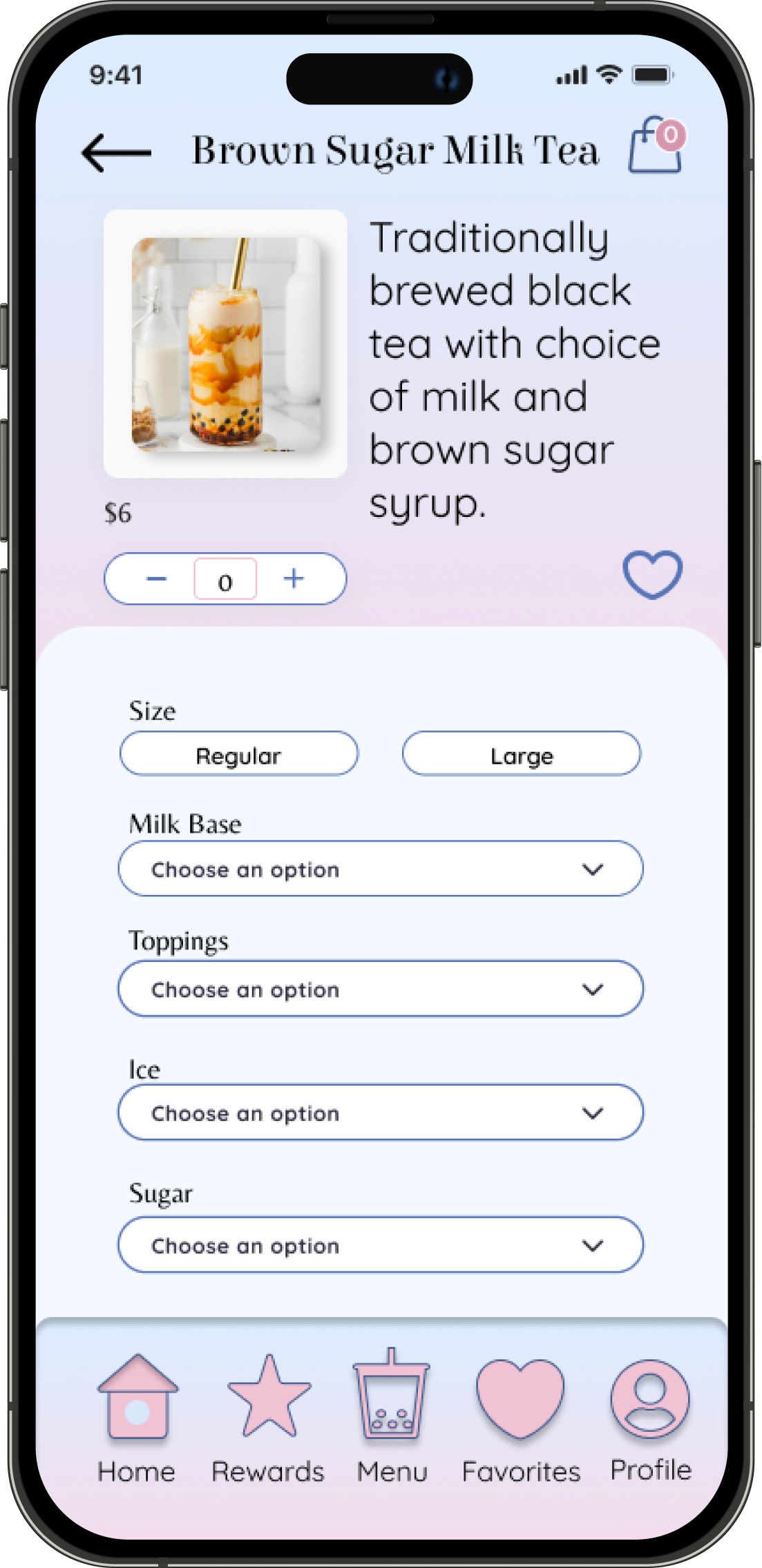
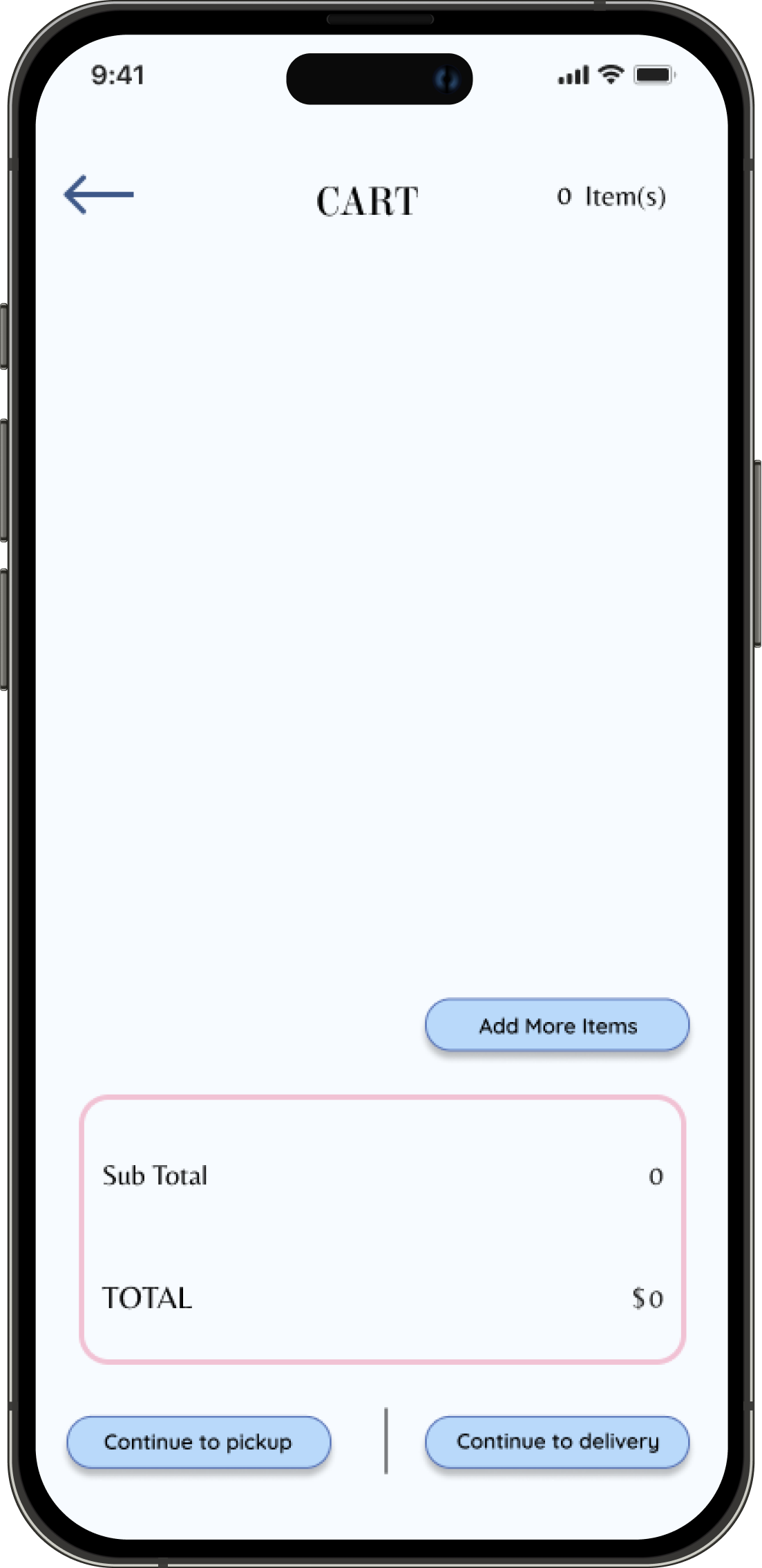
Style Guide
Accessibility Considerations
1) Accessibility button for translation, screen reader, voice control, enlarging or coloring texts, etc.
2) Icons and text and a clean design for easy navigation
3) Images and descriptions to understand the menu easily
Takeaways
Impact:
This project ended on a good note with the client who was more than happy with the results. Cloud Boba will be using this case study to apply it to their real-life app design in the future. “Having an app like this ready for launch will be a great way to show our customers that we care,” says S. Haque, CEO of Cloud Boba.
What I learned:
With this being my first UX project, I am happy with the results and will apply my newly learned skills to more projects in the future. One of my favorite tools that I used was Figma. It offers so much more than what I knew of it and helped me build amazing designs. Every step was a necessary learning process.
Next Steps:
Note: This case study is a project for the Google UX Design Certificate. However, with this in mind, the client has yet to launch the business and will use this project for their branding.
The next step is to apply this design to a real app and conduct continuous research and usability studies. The world is changing constantly and so does the user needs.
Thank you for reading until the end!
To see more of my works, please check more items from this collection or navigate through this portfolio.
I am always available for any inquiries made through my email: contact@bkdesignology.com
